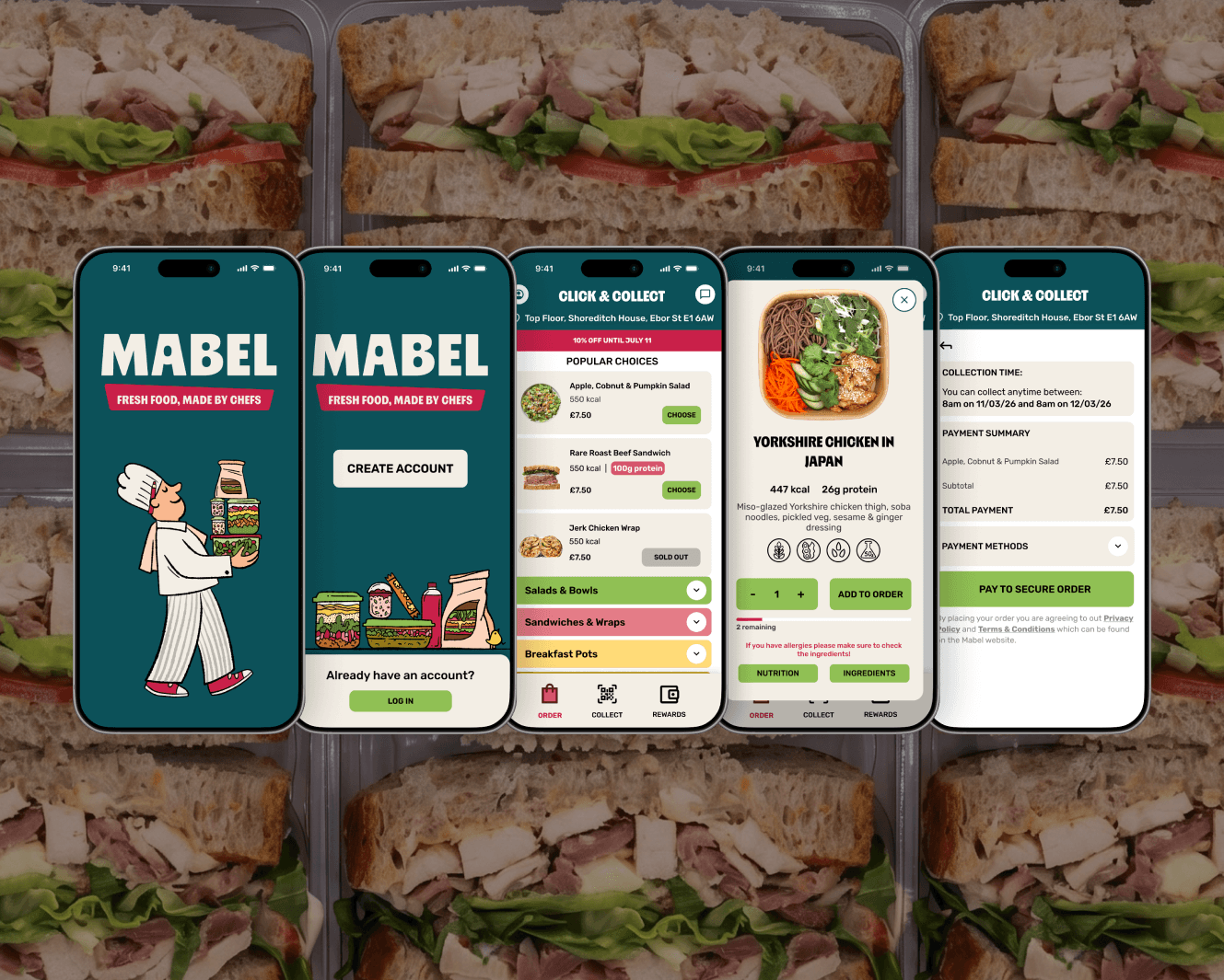
Mabel
2026
Mabel Packaging Design
From blank slate to launch-ready labels across 11 products

Overview
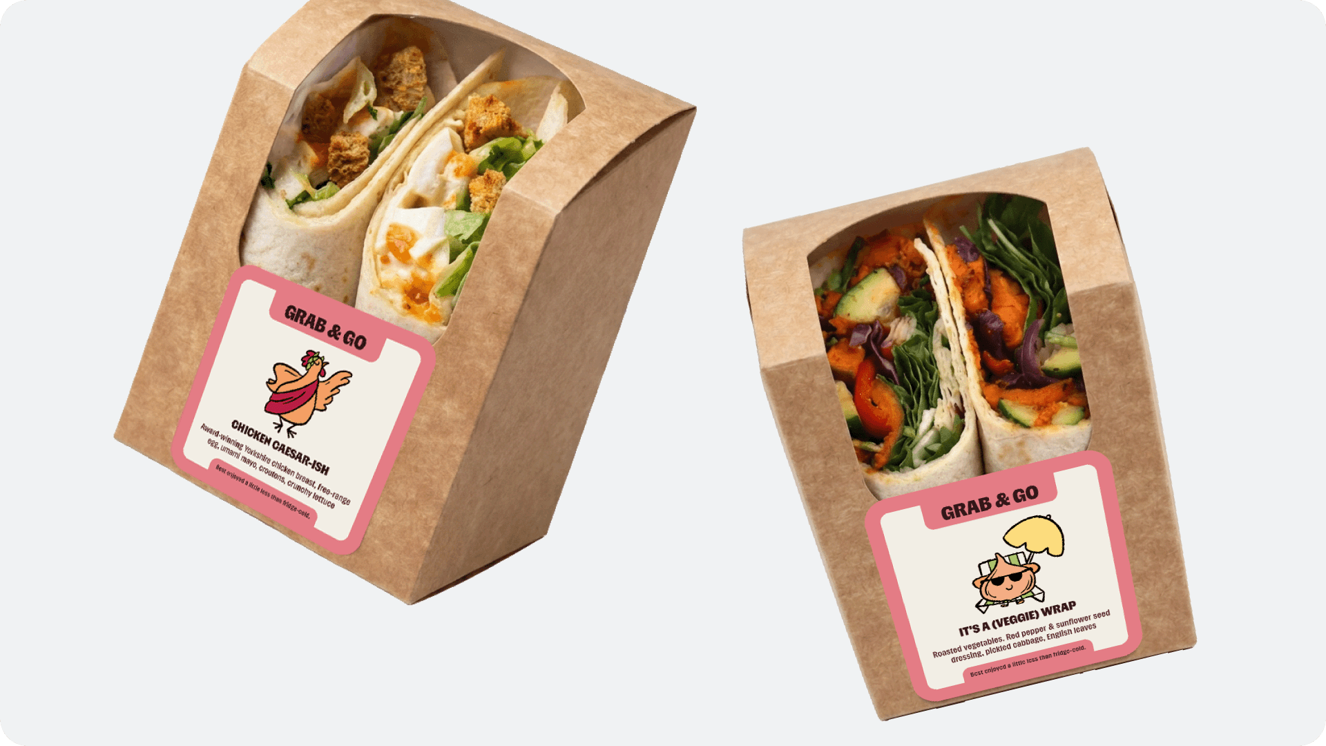
I designed the MVP packaging labels for Mabel, a startup offering chef-made, grab-and-go food through vending machines placed in high-footfall spaces. The work covered 5 product categories and 11 products across the launch menu, each carrying cheeky hand-drawn illustrations, including a chicken with despotic tendencies, sunbathing onions, and dancing bananas.
Problem
Several constraints shaped the design challenge:
From scratch, MVP stage
Designing with limited time and resources, with nothing to build on
Scale and variation
11 different products across 5 different packaging forms and sizes, each needing to work as part of one coherent system
Kitchen reality
The packaging needed to create the least amount of labelling work possible for the people running the kitchen
Compliance
Every label had to meet UK food packaging regulations
Brand and packaging, built in tandem
There hadn't been time to establish Mabel's brand identity beforehand, so the packaging and the brand foundations were being defined at the same time
This last point connected to a bigger question sitting underneath the whole project: people don't associate good, healthy food with vending machines. The packaging had a role to play in shifting that perception, not just labelling the food but making the case for it.
Ideation

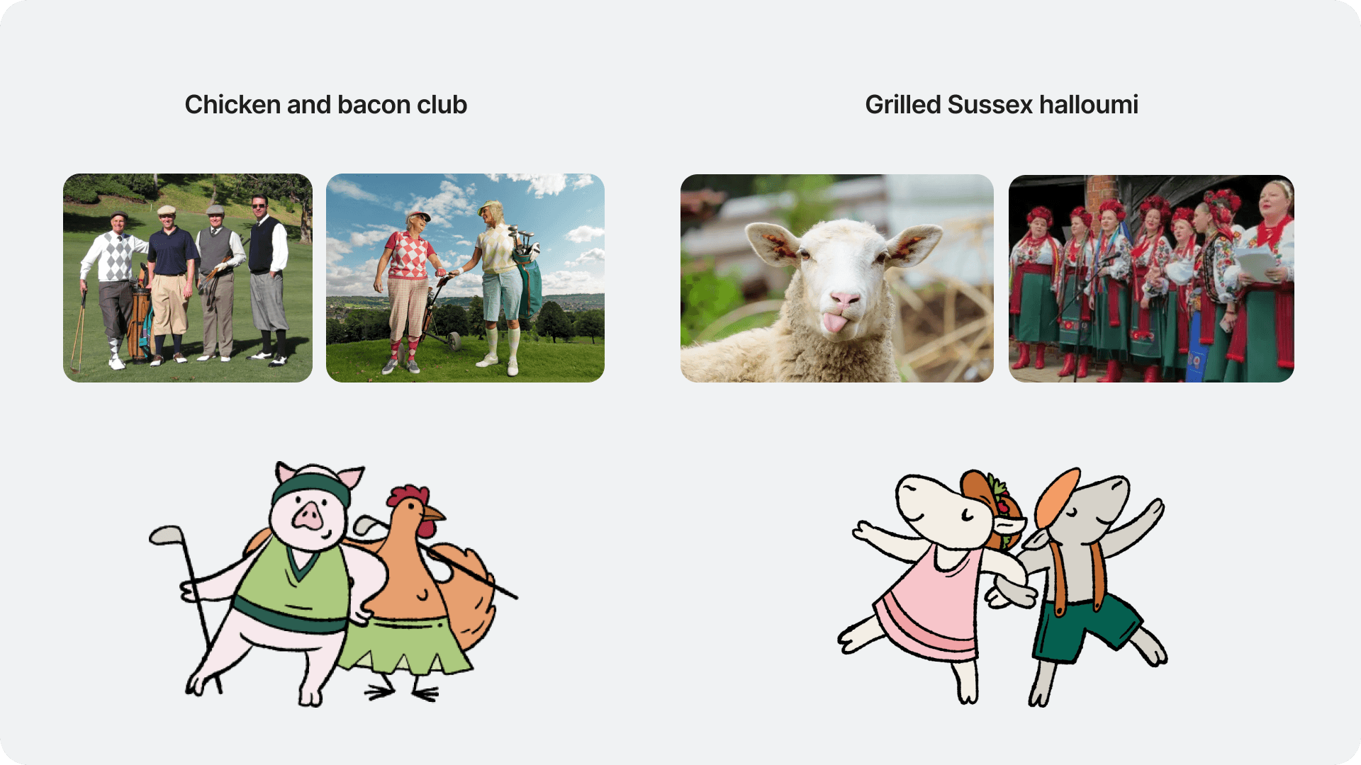
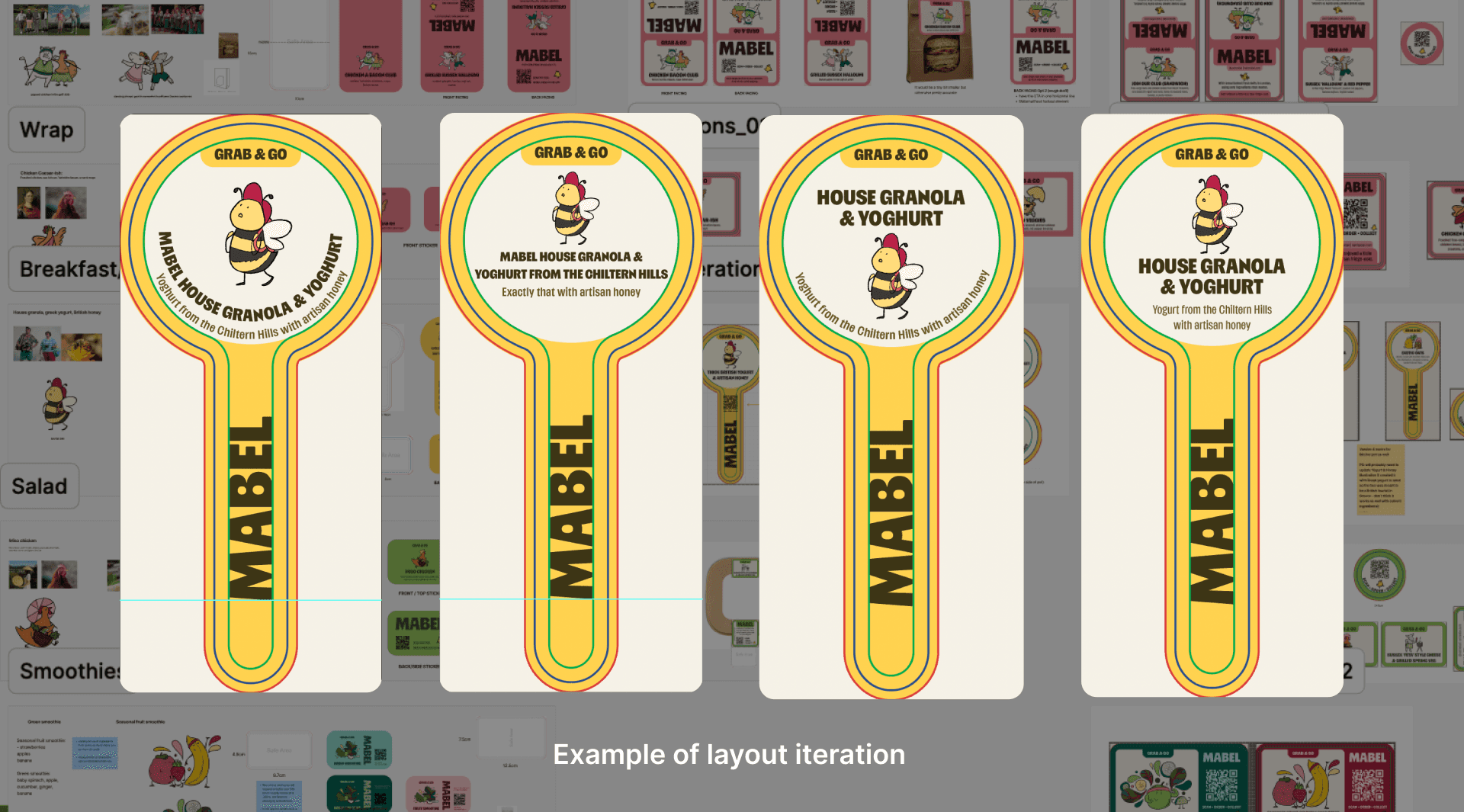
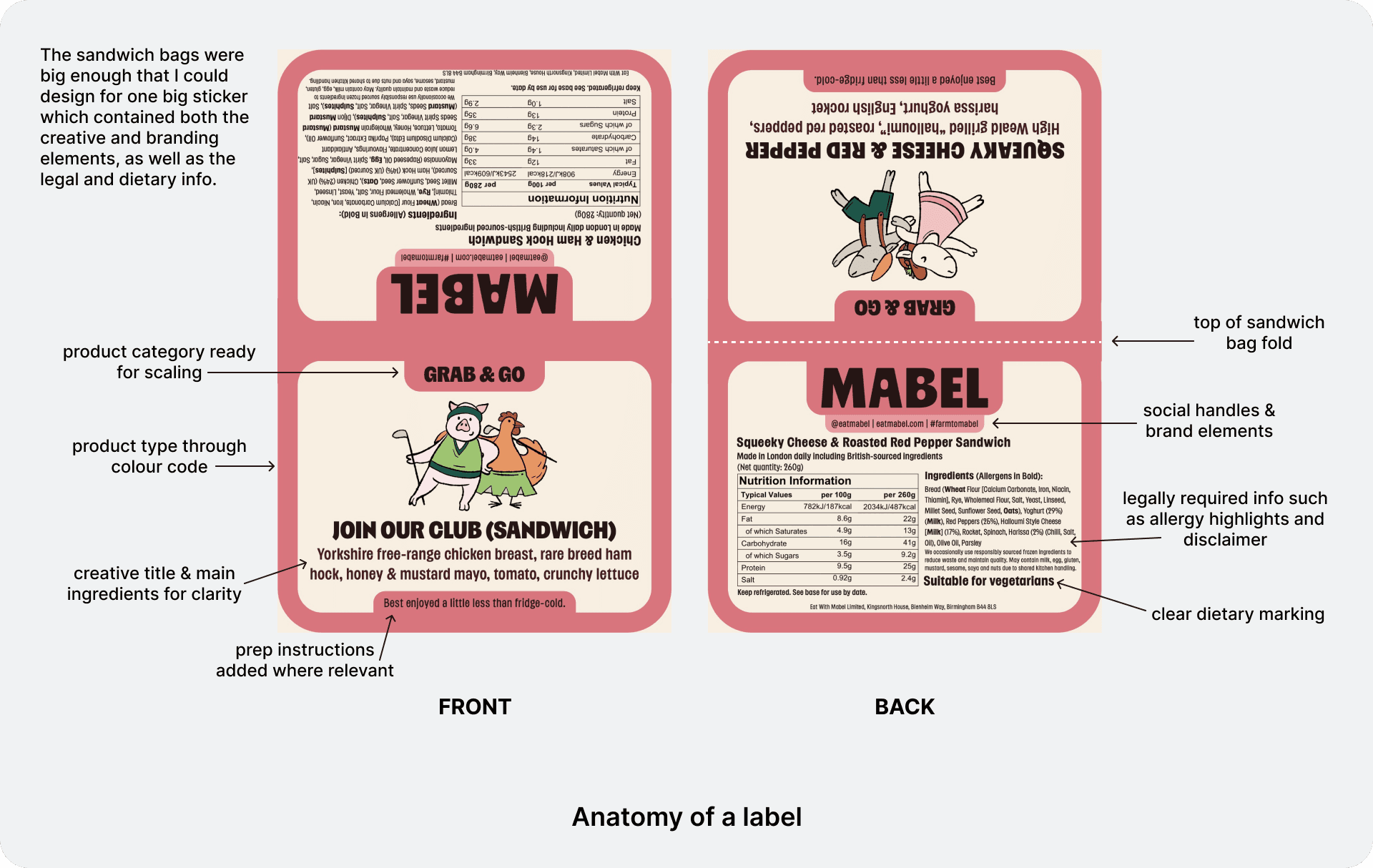
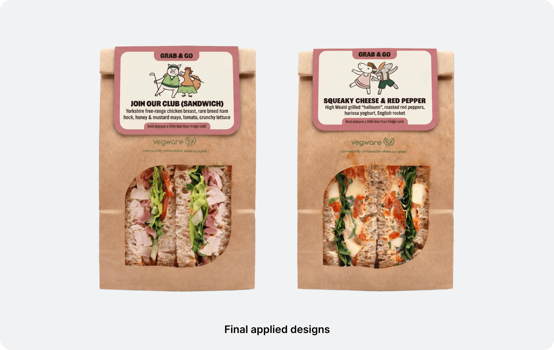
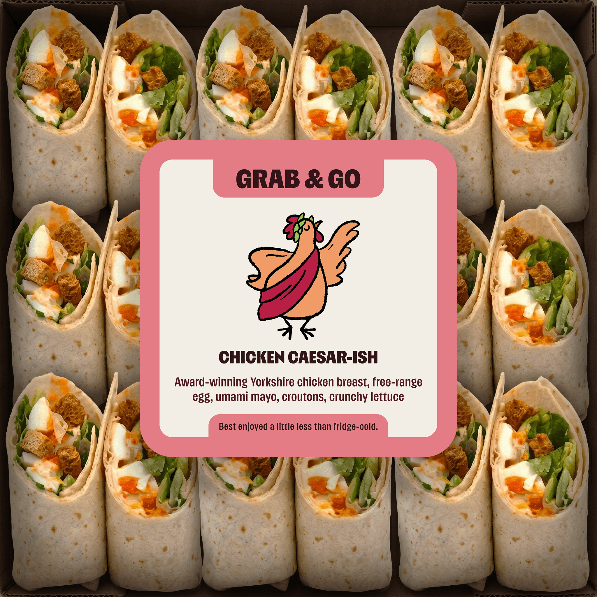
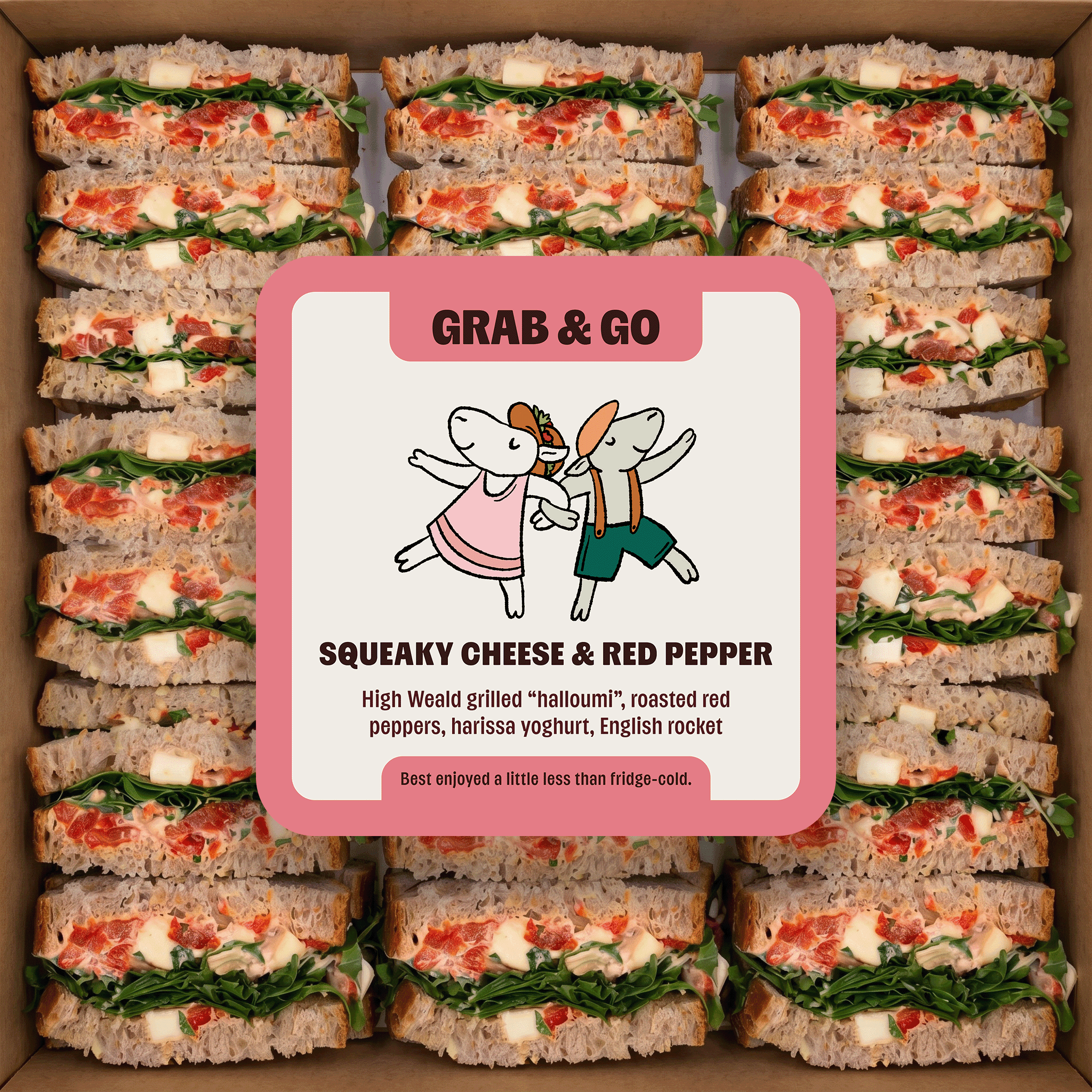
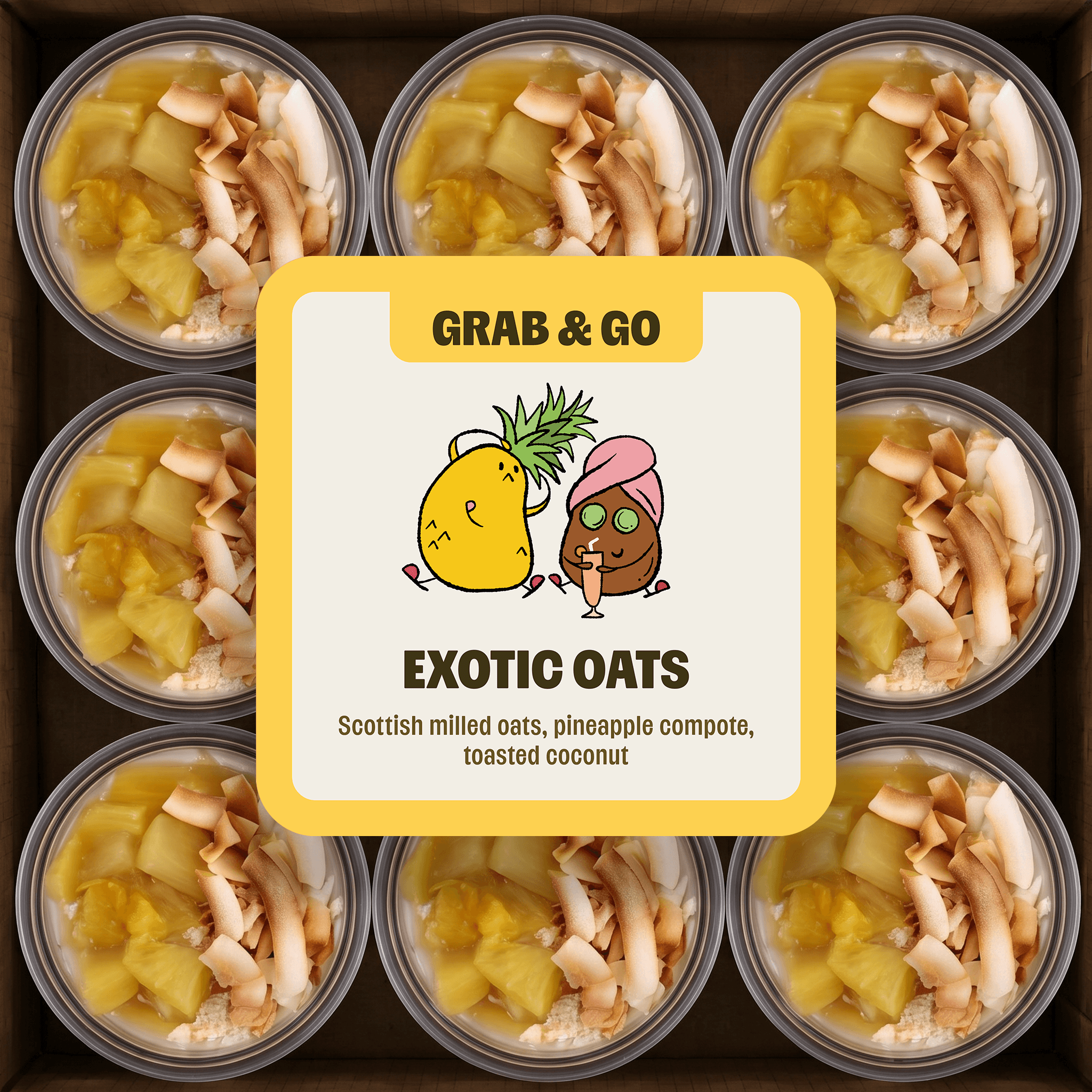
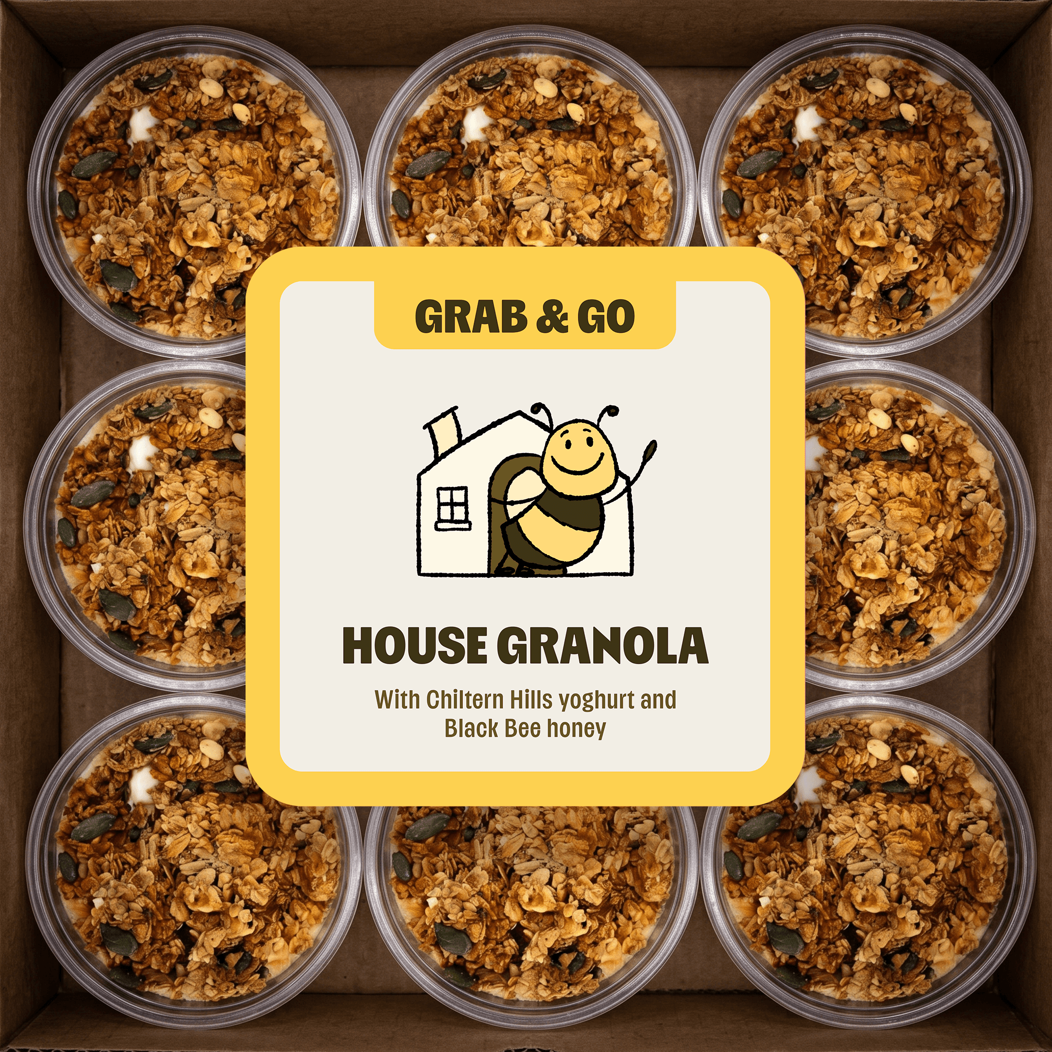
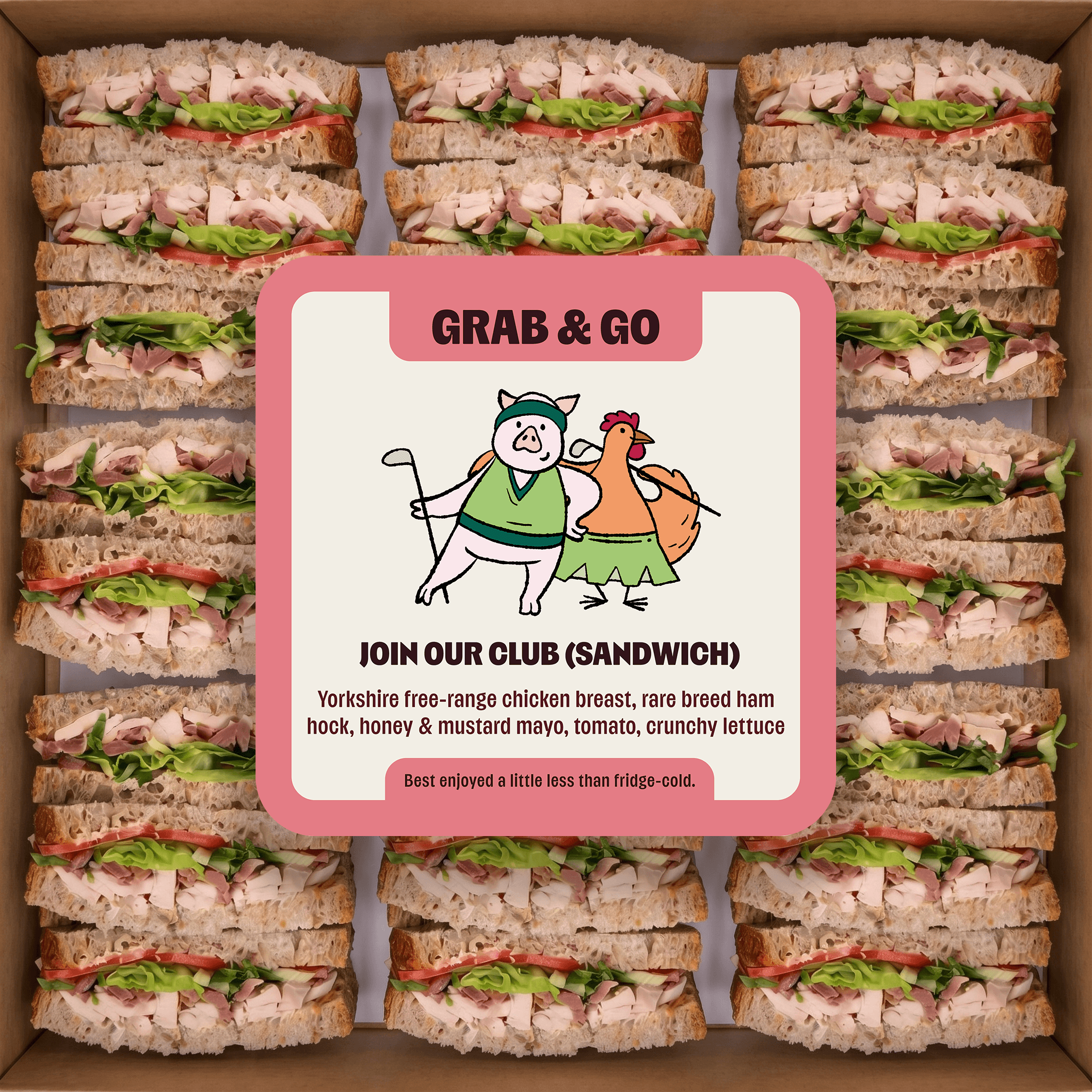
Mabel's brand identity was unfolding at the same time as these MVP labels were being developed. However the vending machine's design has already been finalised (see here for details) which was very much illustration-led and leaned into a cheeky, organic and hand-crafted visual language. We therefore decided to further build on this through the labels and pursue an illustrative route for each meal's primary sticker. Below is an example of how I took the name of each meal and turned it into a memorable illustration asset and designed the labels around them.
Final Designs
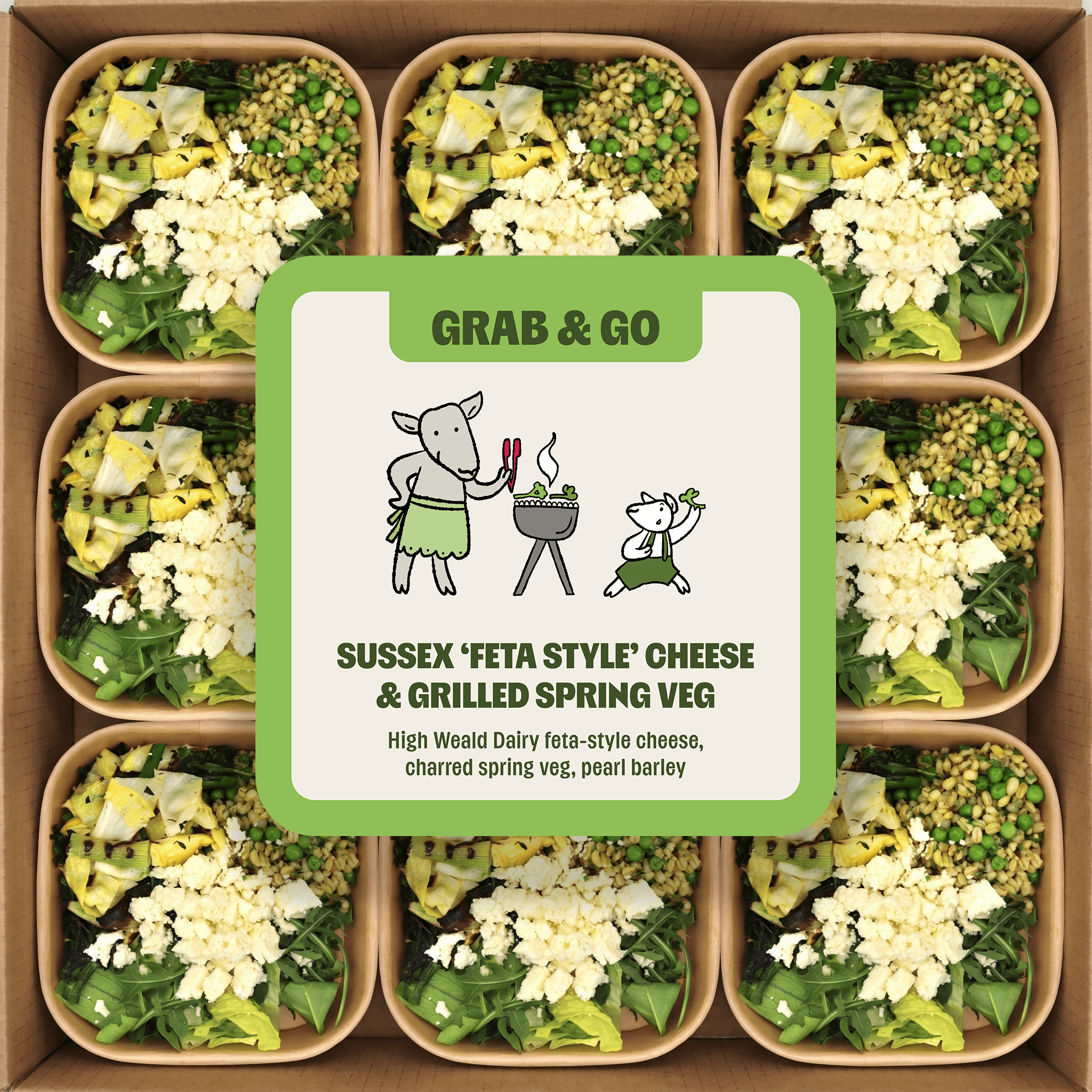
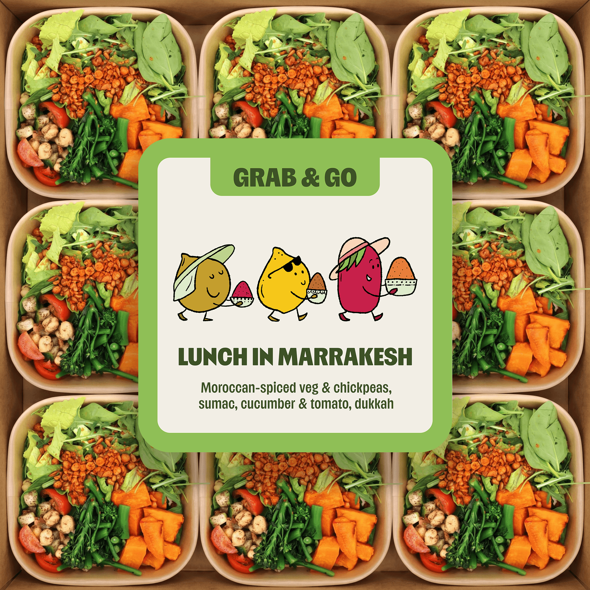
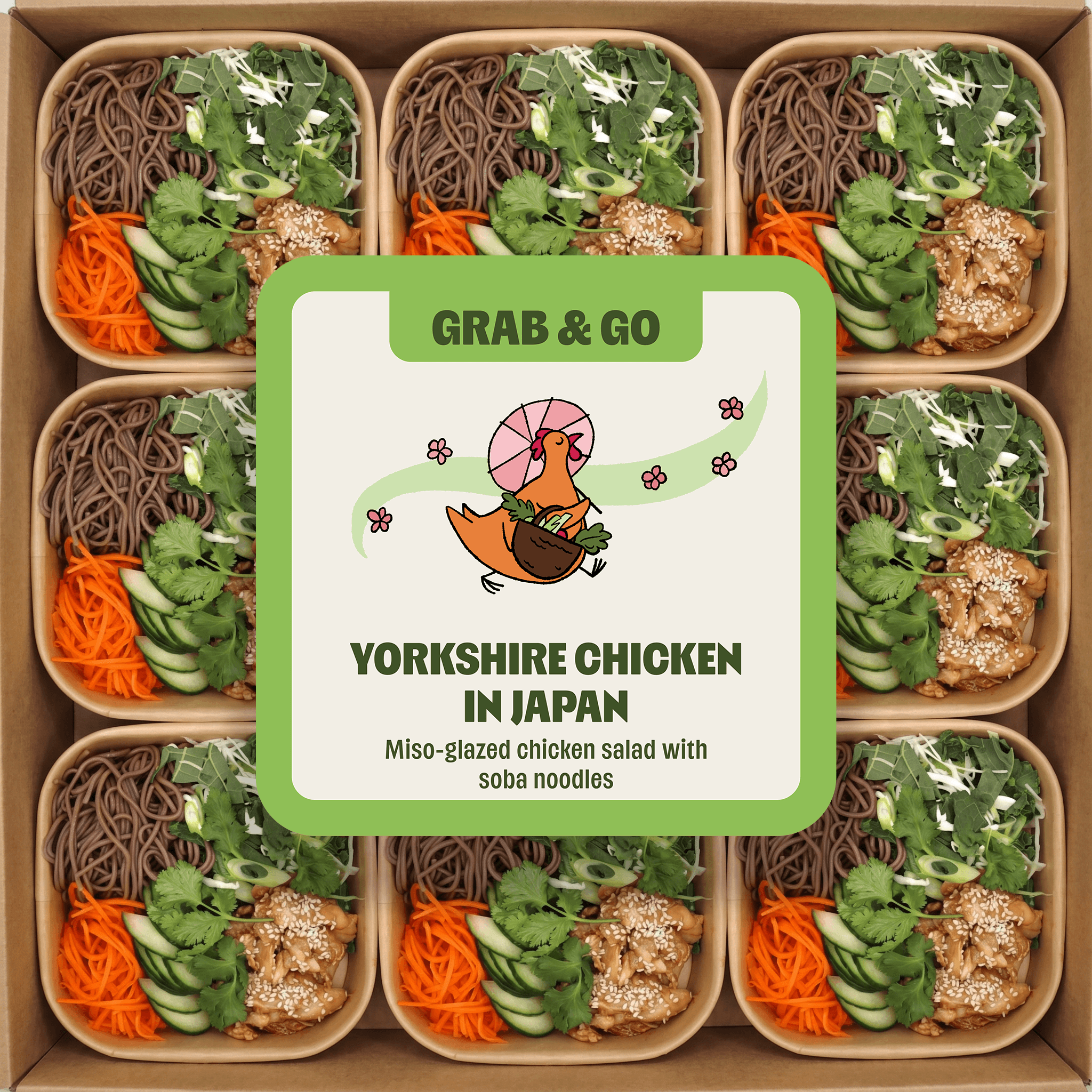
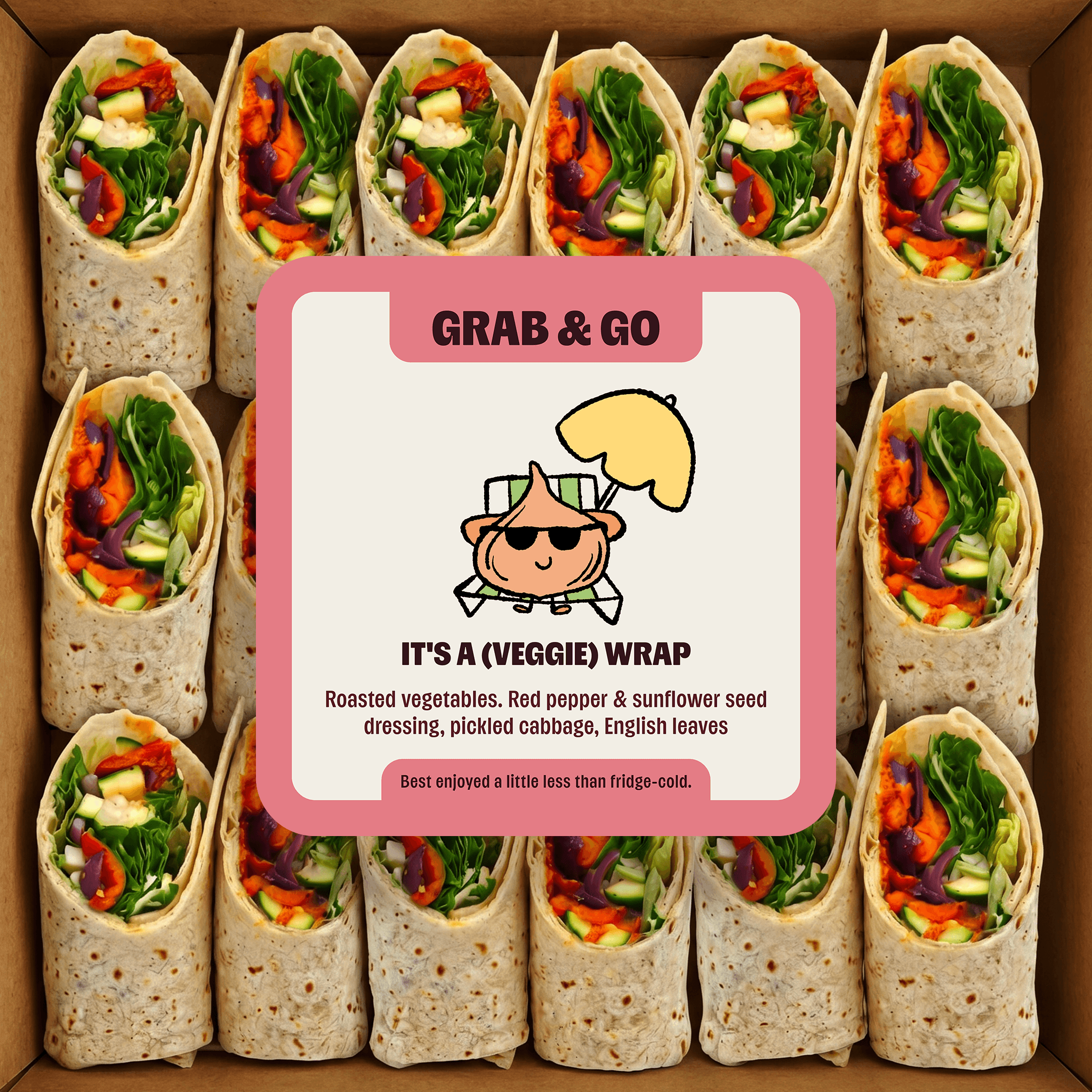
Each product included a front sticker with title, main ingredients and illustration. The detailed ingredients list, nutrition table and other legally required information was placed on the back of the products. We also designed additional rounds stickers with CTAs to download the Mabel app (see here for how I designed the app).
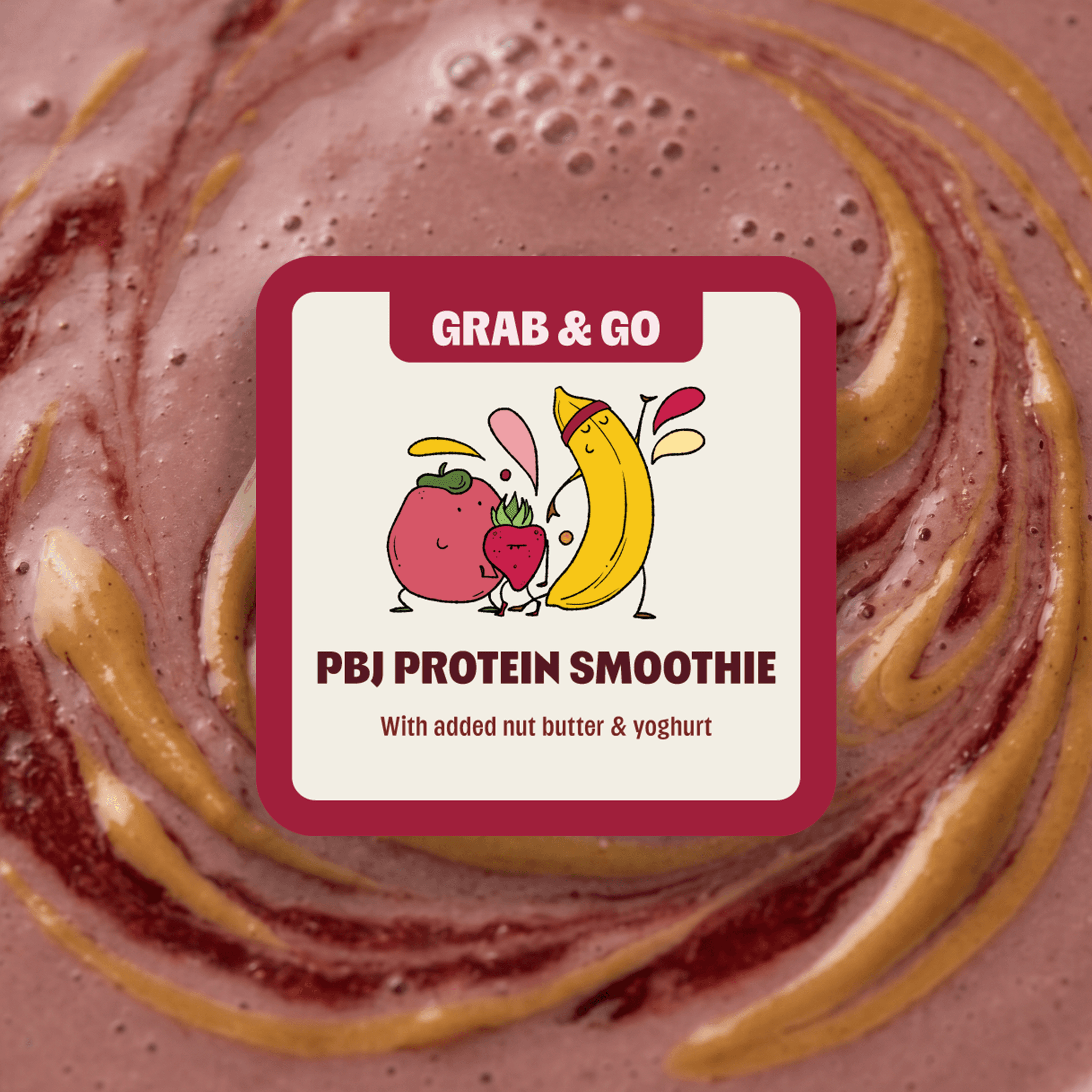
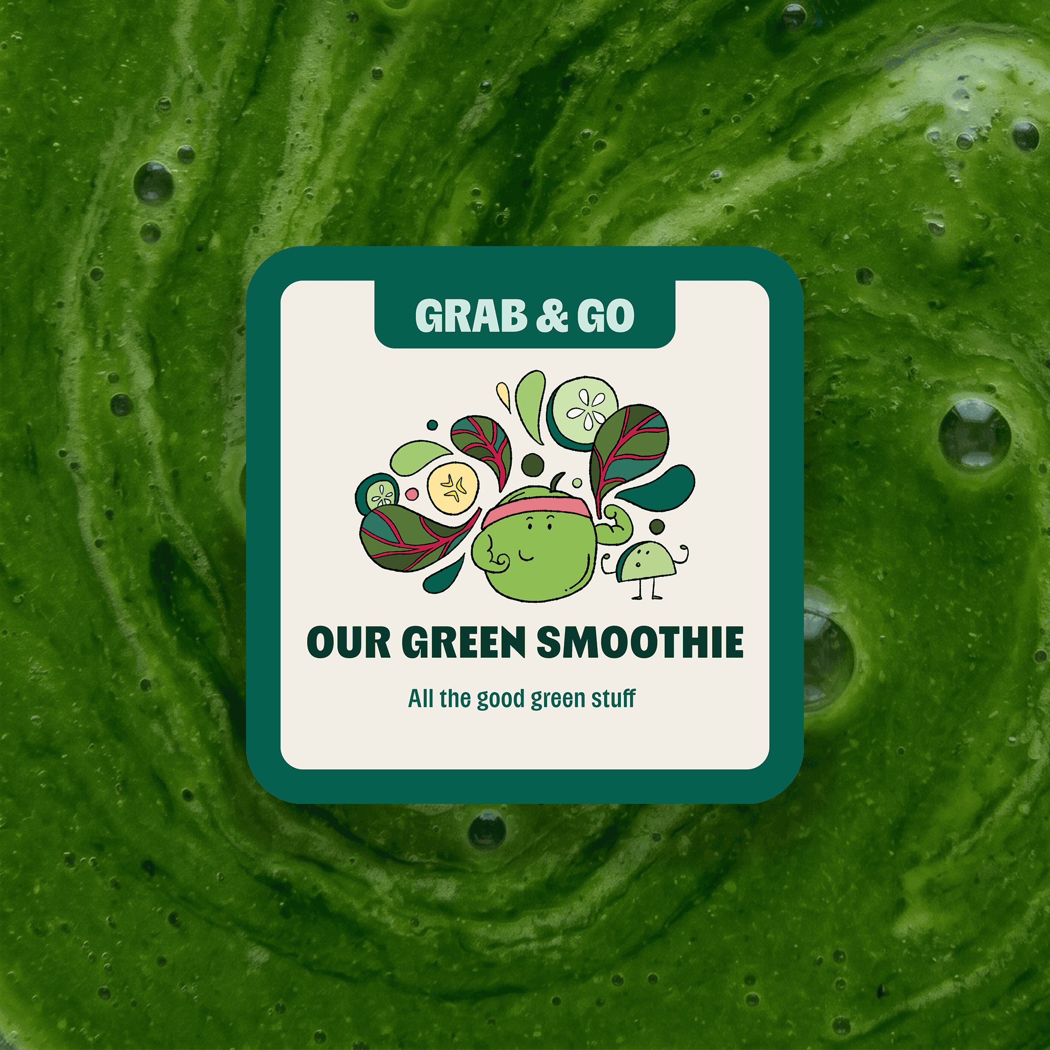
The final designs were revealed at Mabel's launch party in early June 2026. Below is the standardised-dimension version for each product for ease of viewing.
 |  |
 |  |
 |  |
 |  |
 |  |
Lessons
The core difficulty was designing under a stack of constraints at once: tiny and varied label dimensions, legal compliance requirements, and time pressure, without letting any of them flatten the work into something generic.
Working through this tension produced labels that stayed cheeky and joyful, and ended up significantly contributing to the brand: both building and helping to communicate what Mabel was about in a unique way.