Salient Bio
2025
Salient Bio Registration Optimisation
Redesigning a cutting edge biotech firm's registration experience

Overview
About Salient Bio
Salient Bio is a microbiome and pathology testing lab in London. They offer bespoke B2B testing solutions to private healthcare practitioners, and engage with direct consumers via home-delivered testing kits and the digital kit registration process.
Our task was to optimise the digital registration experience for costumers using testing kits at home.
Problem
Filling out Salient Bio’s registration form feels like a chore.
Patients don’t understand why each question matters, inputs are clunky on mobile, and the process feels disconnected from the exciting science they’re contributing to.
This leaves users disengaged and unlikely to share optional data.
We need to make the experience feel purposeful, easy, and human.
Hypothesis
We argued that if users experience a quick, smooth, and satisfying completion of the mandatory section, they will be more inclined to contribute to research, having already built confidence and a positive mental model of the process.
We argued that if users experience a quick, smooth, and satisfying completion of the mandatory section, they will be more inclined to contribute to research, having already built confidence and a positive mental model of the process.
Supporting reasons
• Reduces cognitive load • Improves perceived control • Clarifies progress • Supports modular design
Potential risks
• Drop-off at opt-in point • Emotional disengagement • Context shift • Extra navigation layer
Risk mitigation
• Momentum-based framing • Highlight value • Seamless transition
Development
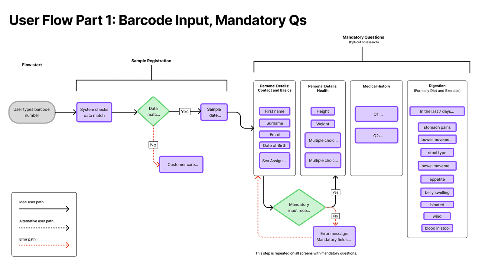
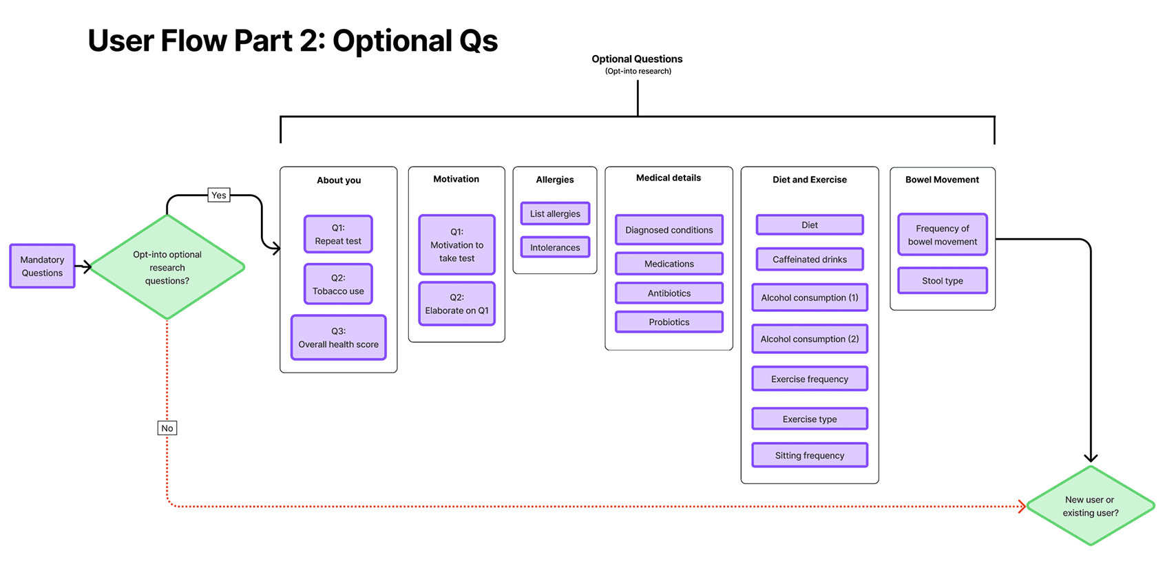
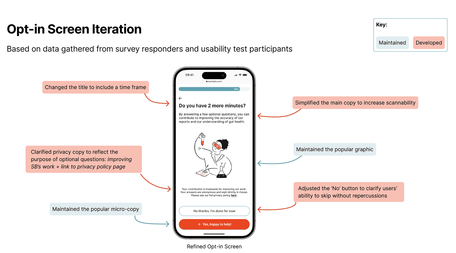
During testing, we found that the form blurred the line between mandatory and optional fields, causing confusion and accidental opt-ins/outs. By creating a clear transition point, users would be able to make a more informed choice.
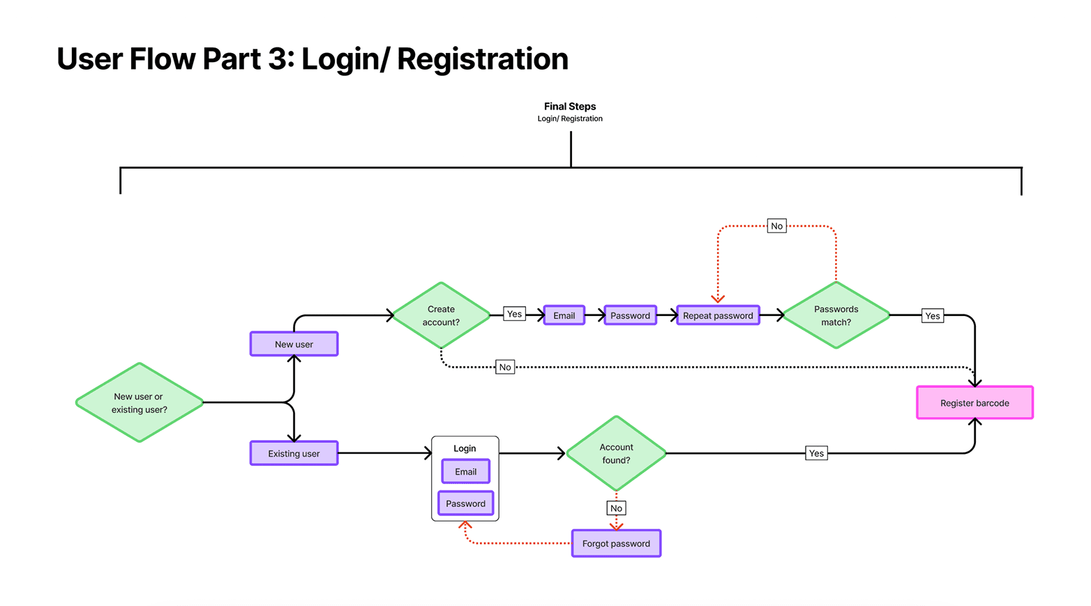
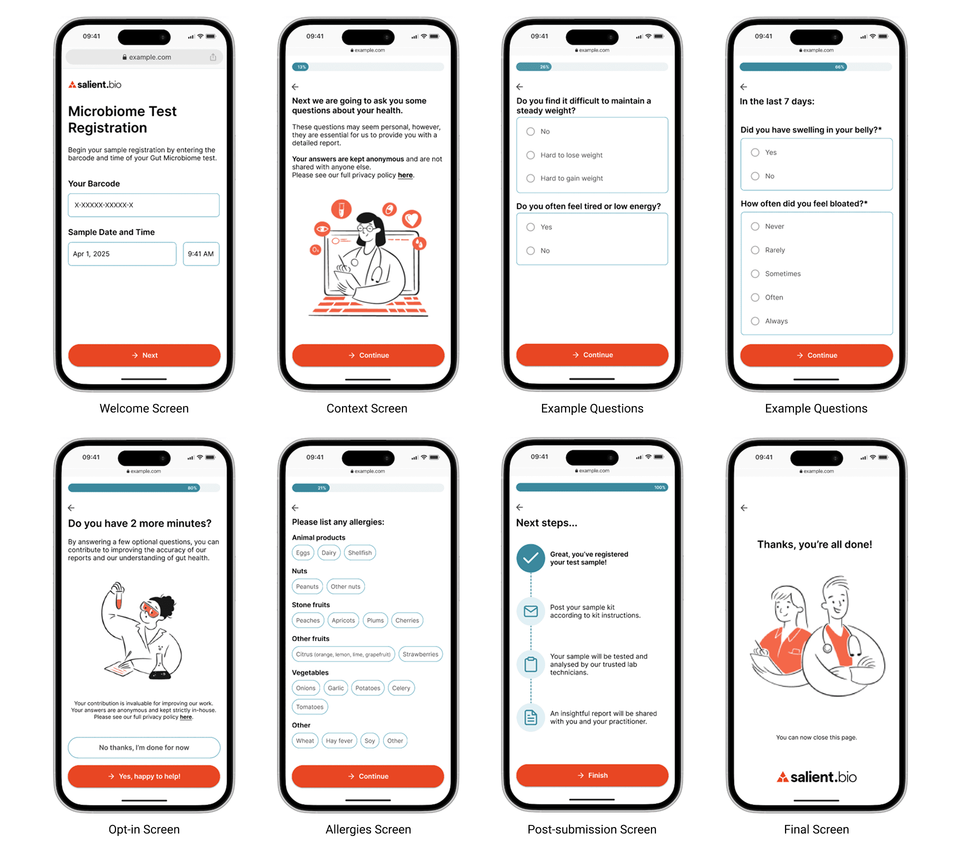
Therefore we chose to separate mandatory and optional questions in the form so that users first complete all required steps before being invited to participate in additional research questions.
Delivery
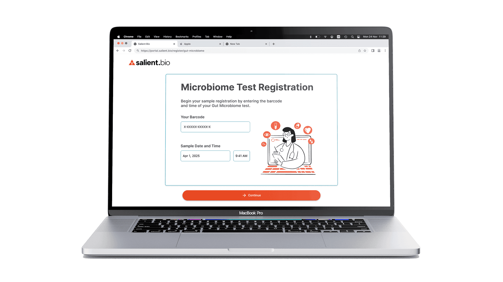
Our hi-fi wireframes underwent rigorous usability testing, while we also conducted a survey to further test and validate our hypothesis and designs. The wireframes shown here are examples of the final designs presented to stakeholders after multiple rounds of iteration.
Results
Reduced perceived time and effort
Despite a small increase in completion time, test participants have reported a smoother and more pleasant completion experience, and said the form ‘felt shorter’.
Test participants also cited:
Reduced cognitive load
Increased delight via layout, colours and graphics
Improved clarity and sense of control over opt-in and privacy protection
Stakeholder Feedback:
I absolutely love this...shows strong attention to detail, thoughtful decision-making, and a high level of visual execution, not just in design but also in presentation as well. The final designs are excellent. The overall UI is clean, cohesive, and visually mature. I also really like how you presented each questions in your design, it just makes the screens very easy to follow.