Wise
2026
Designing App Store Screens for Wise
Adapt and localize Wise Business app store assets specifically for the UK market to highlight relevant business features while balancing marketing appeal with strict App Store guidelines

Overview
Creating Business specific screens for the UK market
Before this project, Wise’s UK App Store presence was heavily focused on personal accounts, offering only a single screen for business users. To better serve and convert UK business customers, I created a dedicated set of business-focused App Store screens.
Leveraging my product design experience on Wise's logged-out web surfaces allowed me to bridge the gap between product feature knowledge and high-impact visual marketing.
Problem
The existing App Store presence didn't reflect Wise Business's full value proposition in the UK.
Personal account bias
The gallery was almost entirely focused on personal customers, leaving business features invisible to potential users.
One-size-fits-all approach
A single token business screen was not enough to showcase complex features like invoicing, multi-currency account details, and international batch payments.
Research & Benchmarking
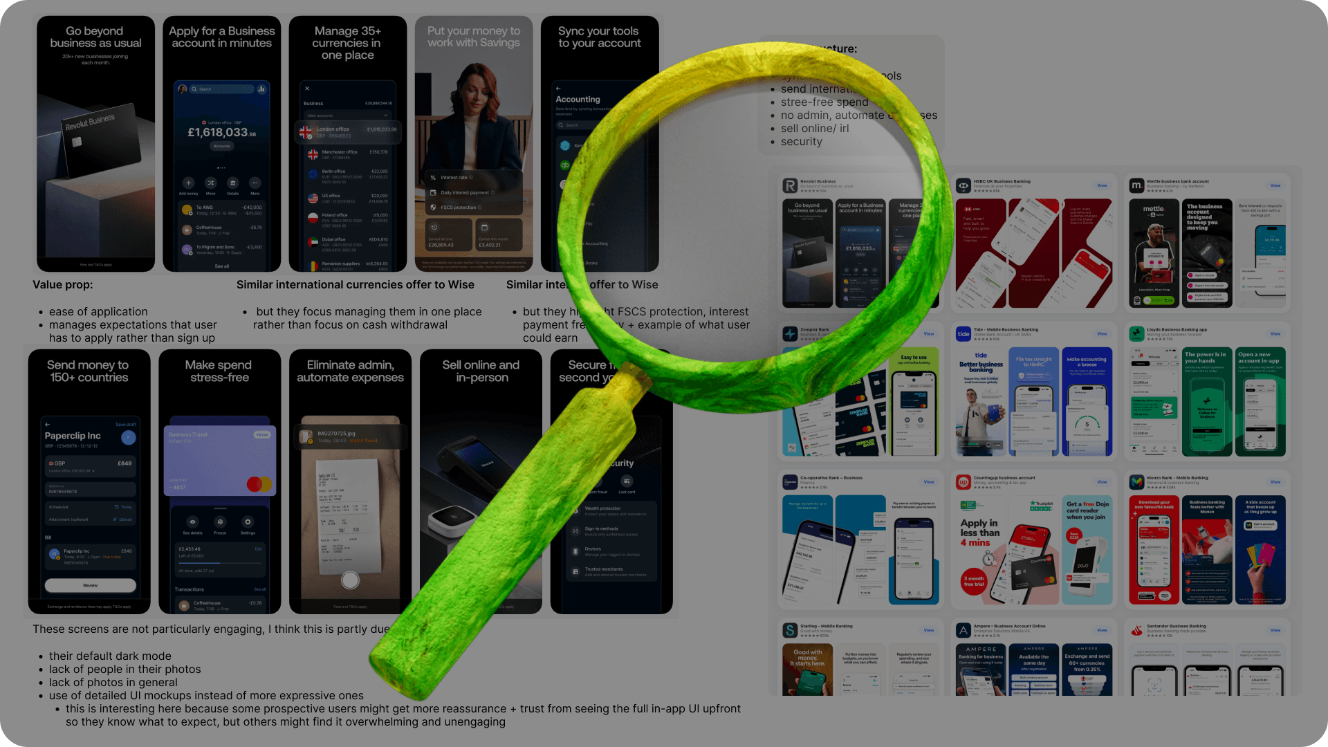
To position the new screens effectively, I looked closely at how competing fintechs presented their business products in the UK App Store.
I benchmarked visual hierarchies, screen ordering, and messaging used by top UK business finance apps.
Ideation
Rather than starting completely from scratch, I collaborated across teams to build on existing internal work.
Building on prior patterns: I used the US business App Store screens created by a fellow Wise designer as the baseline pattern and general layout.
UK localization: I adapted these foundations to fit the UK market, switching out UI examples with local flags, relevant regional currencies, and tailored visual cues.
Content design partnership: I worked directly with the Lead Content Designer in the Product Discovery team to ensure the order of features and specific language resonated with local business tone and terminology.
Strategic feature sequencing: While the US market is heavily "send"-focused, we reordered the UK screen sequence to lead with high-intent local priorities: receiving money, multi-currency account details, and invoicing tools.
Early Ideation Wireframes

Designs
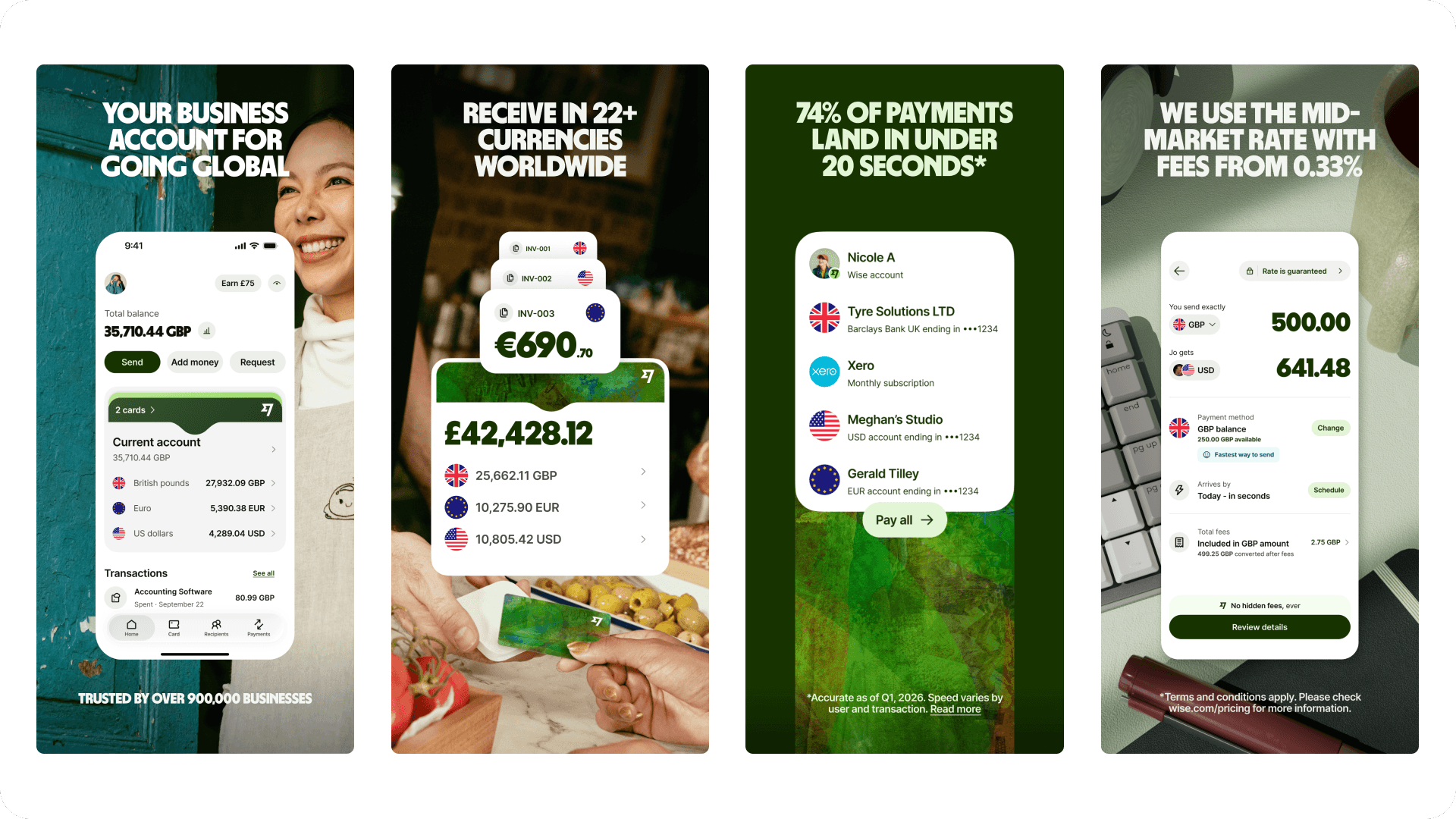
Prioritized screen order:
Global Reach & Social Proof: Business account for going global, highlighting our trust metric of 900,000+ active business customers.
Core Revenue Drivers: Receiving payments and invoicing features—prioritized specifically for UK business needs.
Payment Performance: Highlighting the speed and reliability of outgoing business payments.
Transparency: Mid-market exchange rates with zero hidden fees.
Growth & Yield: Wise Interest features to help businesses grow their balance.
Trust & Compliance: Bank-grade security and fraud protection details.
Reliability: Dedicated 24/7 customer support for business account holders.

Lessons and Challenges Overcome
Switching design mindsets: Transitioning directly from web sign-up flows to static mobile assets required a shift from interactive UX design to static visual communication within fixed screen boundaries.
Compliance and precision: Precision was non-negotiable. Every conversion rate displayed in the UI mockups had to reflect actual mid-market exchange rates to pass strict internal compliance and financial regulatory checks.
Balancing marketing vs. app store rules: App Store guidelines prohibit over-stylized or misleading marketing graphics, assets must represent the actual in-app experience. I balanced regulatory compliance with visual appeal by framing real UI components against clean, brand-aligned visual hooks that drew attention to key features without breaking store rules.
Product context as a marketing asset: Coming straight from product discovery meant I understood the nuances of the business features inside out. This allowed me to highlight real product value authentically, rather than just creating pretty screens.