Wise
2026
Redesigning the Wise Business Sign Up Page
Reimagining the logged-out sign-up screen to increase trust and business feature comprehension while driving sign up conversion.

Overview
I led an exploratory initiative to refresh the Wise Business sign-up page. The goal was to align the sign up screen with recently redesigned web surfaces, giving prospective business customers a reassuring, context-rich entry point before committing their details.
Problem
A central problem the Product Discovery team behind Wise Business faces is that potential customers don't understand Wise as an all-in-one solution and are unaware of features and benefits.
The logged-out web pages have been recently reworked to address this issue, however the sign-up page remained outdated, creating a jarring disconnect for prospective customers.
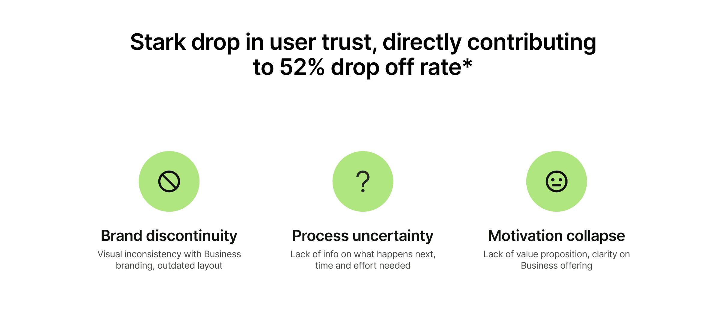
The "shop window" dilemma: The Discovery team's PM described the team's work as taking care of the shopwindow of Wise. So if the web pages serve as the shop window to the world, the sign-up page functioned like a blank, uninviting door that half of interested visitors refused to open.

Research and Discovery
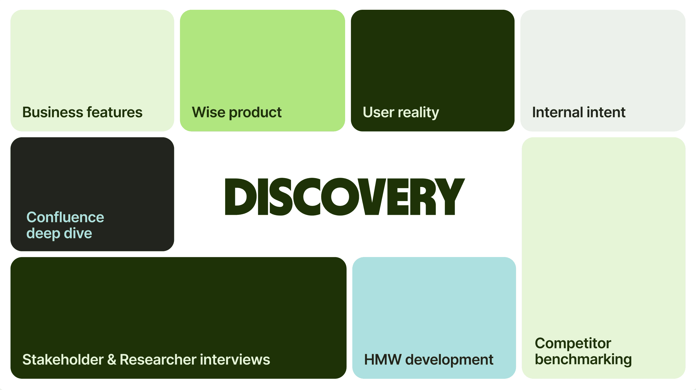
To inform a user-centred redesign, I audited existing assets; benchmarked competitors such as Revolut, Monzo and Airwallex to evaluate where email capture happens and how feature benefits are communited; and also synthesised insights with cross-functional stakeholders including UX researchers and design directors.
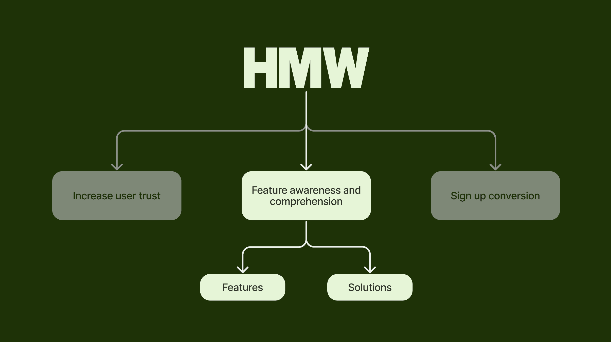
Framing the HMW
How might we increase user trust, as well as awareness and comprehension of Business features, while still driving core sign-up conversion?
Ideation and Collaboration
Given that onboarding flows beyond registration fell under product-side scope, I focused on optimizing the logged-out entry point within current constraints.
Dual-track structure: I designed two distinct, modular entry points aligning with Wise's site architecture—a Feature-led direction (linking from specific feature pages for example accounting software integration) and a Solution-led direction (linking from the use-case pages like freelancers or startups).
User Testing
Ideation took two stages: one at the beginning of the project, and a secondary one post user testing to integrate its insights.
Risk-averse mindsets
Business owners search with worst-case scenarios in mind, seeking explicit proof of financial protection and access to human support over vague marketing copy.
Authentic social proof
Prospective users trusted unbiased platforms (Trustpilot, Reddit) far more than brand promises.
Email as leverage
Email is viewed as leverage not to be given away lightly. Users resist providing it without knowing the exact value proposition, fearing spam and difficult account deletion.
Minimalist fallback: Based on user testing feedback, I also created a third, minimalist variation for users landing on sign-up directly without prior site browsing. Here users have the option to open the Business landing page in a new window to discover the offering in more detail. This was a significant change from the initial design direction which opposed navigating users away from the sign up screen. However, test participants explicitly asked for this and we aimed to mitigate potential drop off through CTA placement and language as shown below.
Content design partnership
I worked closely with the Content Design lead in our team to rework the information structure and microcopy based on user testing. One example of our collaboration is the sign up card:
Refined headers to explicitly clarify that users were opening a business "bank" account.
Added subheadings positioning Wise as an everyday global business account, not just a money transfer tool.
Replaced unrealistic promises ("sign up in minutes") with transparent guidance on support to build authentic trust.
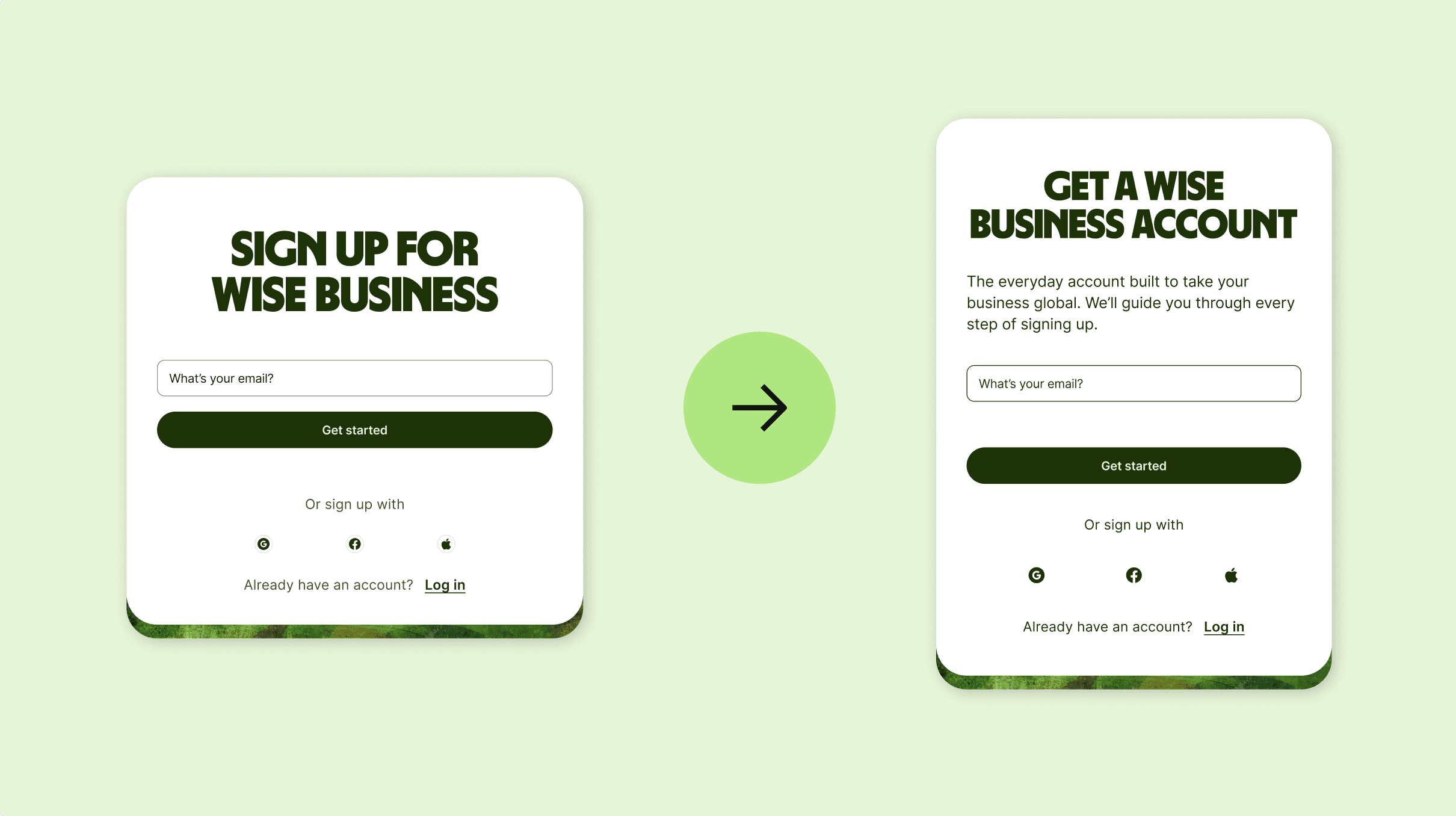
Timelapse of iteration from low to hi-fi
Final Designs
The finalised directions offer high-impact, adaptable layouts tailored to where the user enters the funnel:
Minimalist overview: A lightweight version backed by social proof (e.g., 900,000+ business customers) and clear links back to core discovery pages for undecided users.
Feature-led design: Deep-dive cards highlighting specific tools (e.g., batch payments, multi-currency account details) linked directly from feature subpages.
Solution-led design: Tailored messaging reinforcing specific user personas (e.g., freelancers, scaling startups) arriving from solution landing pages.
Designs on mobile:
Lessons and Challenges Overcome
Managing project scope
Identifying endless design opportunities required strict prioritization. I structured my roadmap into Now (core feature/solution variants), Next (per-page customized variants), and Future (deeper onboarding integration) to deliver maximum impact within a 6-7 week design cycle.
Navigating cross-team alignment
Discovered through iteration that product onboarding teams were simultaneously working on shifting email collection later into the flow. While this meant my immediate mockups served as strategic discovery rather than direct implementation, it opened avenues for alignment between Discovery and Onboarding teams.
Leveraging product context for marketing
Operating on logged-out web surfaces reinforced how vital real product understanding is when designing top-of-funnel conversion points. Deep knowledge of feature mechanics and compliance limits ensured the designs provided real clarity rather than empty marketing promises.